Wedding Website: Setting The Tone For Your Day
Now that our wedding is only a few months away, I’m excited to start sharing our journey to planning our dream wedding. We found that the best way to dive into wedding planning, was looking at the tone we wanted to set for our wedding. The first thing guests see are your wedding website and your stationary. It sets the the tone for your day, so you want to ensure you look for ways to clearly show your guests what the vibe will be.
In the early process of wedding planning, I focused on wedding websites. I wanted to have a wedding website that matched our stationary. A wedding website and wedding stationary set the tone for the wedding and indicate to the guests what the vibe of the wedding will be.
Wedding Website
I did this kind of backwards, I will admit. Kevin and I looked at wedding website templates before we looked at stationary options. I just crossed my fingers there was a matching stationary set! Luckily for me, there was a matching set of stationary that went with my wedding website template. As I started to think of my wedding vibe, I was concerned with us getting married outside and in the summer. I didn’t want my wedding to come off as too casual or rustic. To counteract that, we went for more of a formal wedding website and stationary set.
I was aiming at classy, clean and formal for our stationary. We had been looking at different options for who to go with for our website and stationary. Ultimately, we found that Minted had everything we wanted in a wedding website template. We opted to upgrade our free website to include a custom URL which was a one time fee of $15. Since we wanted people to RSVP online, we found it worth the $15 for our own URL.
Pros of Minted
I looked at a few different options before I decided to go with Minted. In addition to Minted, I also looked at The Knot and Zola for wedding websites. When setting up the website, I really liked how user friendly it was. I was quickly able to figure out how to use the pages and different options for layouts. It was a very easy process to input the information I wanted.
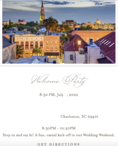
A few of the things we were looking for in a wedding website was the ability to do a photo gallery. We had so many engagement pictures that we wanted to share. I was also looking for the option to have an events page. Since we chose to get married on a big holiday weekend, we wanted it to be more of a wedding/celebration weekend and not just a one day event. We wanted to share with our guests all of the events we were inviting them too. The events page made that very easy to put in details for our wedding, as well as our welcome party. It also had a map at the bottom of the page where guests could click on the event, and the map would automatically pull up on Google maps.

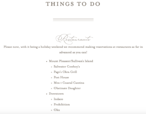
There was also the option of adding on additional pages which I found very helpful. With us tying the knot in such a beautiful city, we wanted our guests to know what there is for them to do for the weekend. On our website, we included an additional page for ‘Things To Do’. Our wedding is a destination to everyone except for us, so most of our guests will be staying a few extra days. We wanted to include activities for our guests to do as well as some of our favorite restaurants.

Cons of Minted
Although I loved our wedding website, there was one process that I wish would be improved. For our rehearsal dinner, we were required to gather meal options from our guests that were attending. The only option was just for guests to write in what they wanted. I think the design element could be improved by doing a click button for what each guest wants for the first course and second course. This would eliminate people forgetting to include what they wanted, or only putting in what they wanted for the first course, and not the second. That is really the only part of the website where I felt could use a little improvement.
Overall Thoughts On Our Wedding Website
I really loved our wedding website! It definitely helped set the tone for our wedding to be more of a formal affair. The script text along with the clean colors helped make the vibe more formal. We have started to receive RSVP’s and are having so much fun tracking when they come in.
I love how easy it was to use Minted. Everything about the process was so simple. We were able to get what we were looking for in a wedding website and stationary set, all in one place! Kevin and I have received so many compliments on our website as well.
I would love to hear about your wedding vibes below! Tell me all about what aesthetic you were going for, and how you incorporated that vibe into the details.
XoXi,

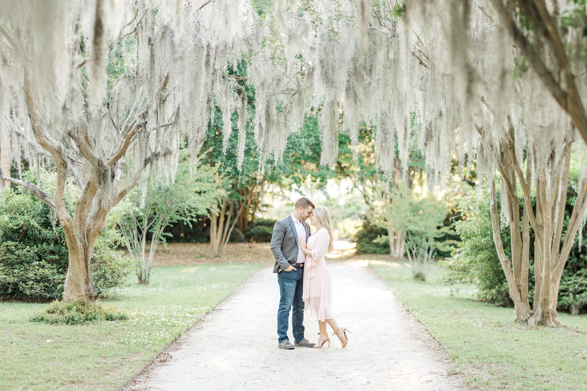
Photo at the top was captured by Karen Schanely Photography.


2 Comments
How To: Prep For The Wedding (Botox) – Future Southern Belle
November 27, 2022 at 1:31 pm
[…] you liked this wedding content, be sure to check out my other post about setting the tone for your wedding […]
First Look vs Walking Down the Aisle – Future Southern Belle
April 28, 2024 at 6:07 pm
[…] can read more about how I set the tone for our wedding day here. I also did a lot of prep work for getting my skin in great shape for our wedding. You can read […]